Nahr
Rebranding an NGO is not about beauty alone. It’s about function, awareness, and purpose. Visual identity matters, but it must stay grounded in the reality of the field, especially in conflict areas where trust and clarity are essential.
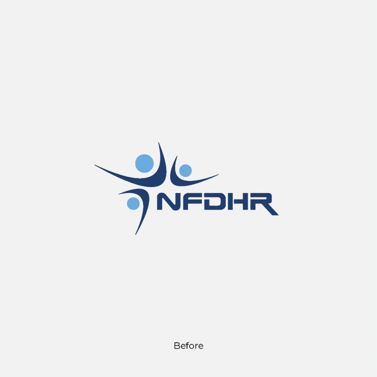
We were approached by what was then called NFDHR, the National Foundation for Development and Humanitarian Response, to rethink their brand. It’s rare to work with a team so open to change, regardless of its scale. That openness shaped a genuine and collaborative process.
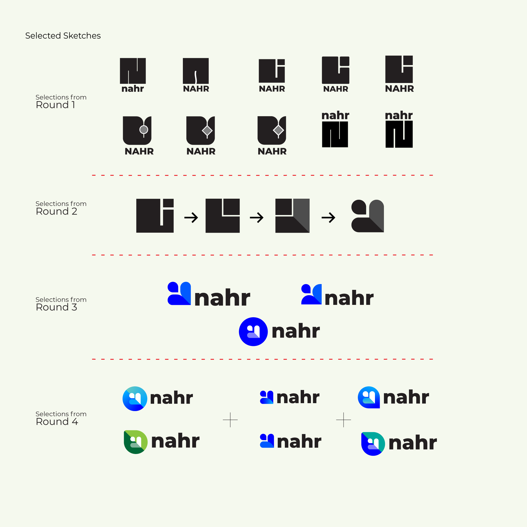
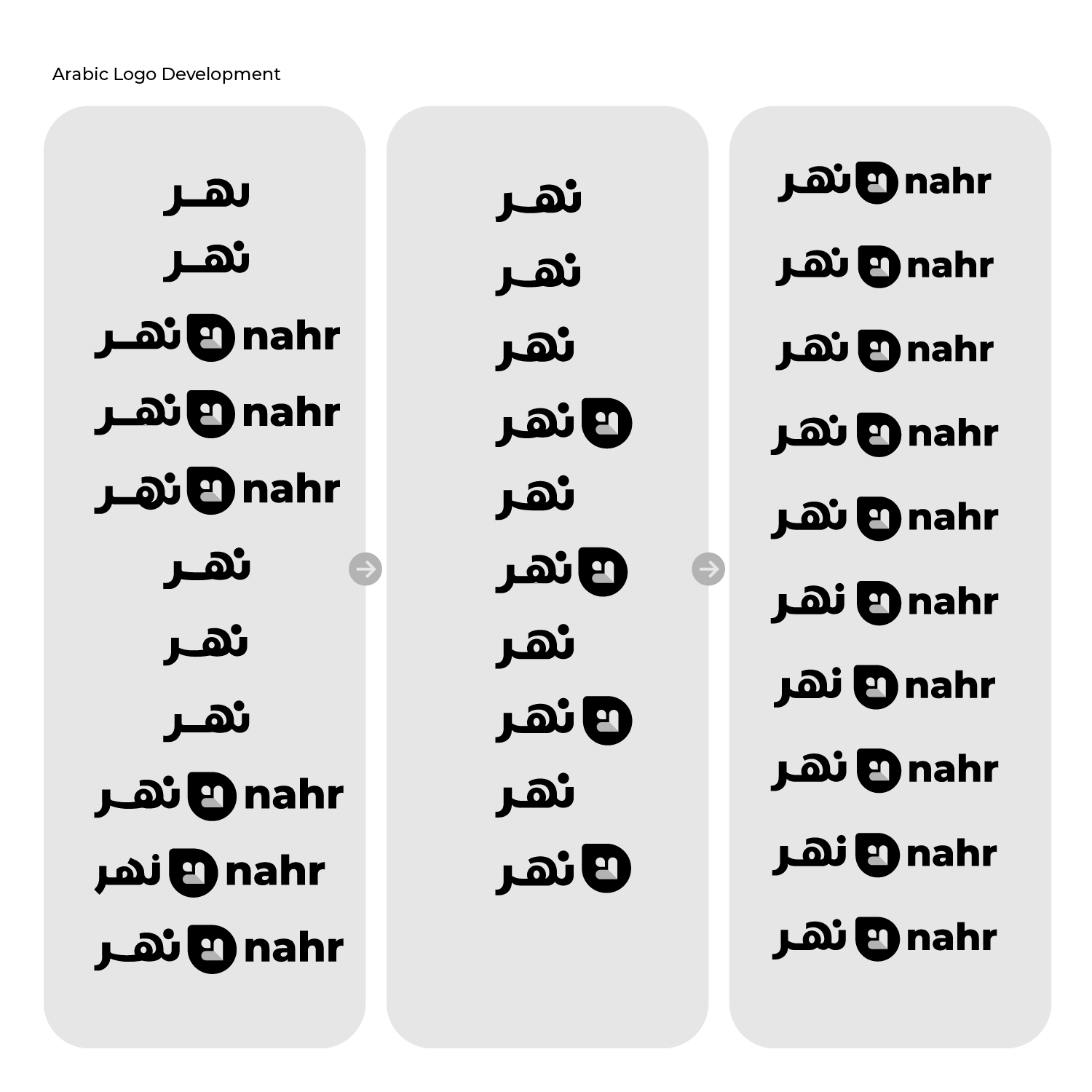
Naming was developed together with the organization. We explored many directions, tested ideas, and narrowed them down step by step. Some names felt too complex. Others didn’t say enough. One name stood out.
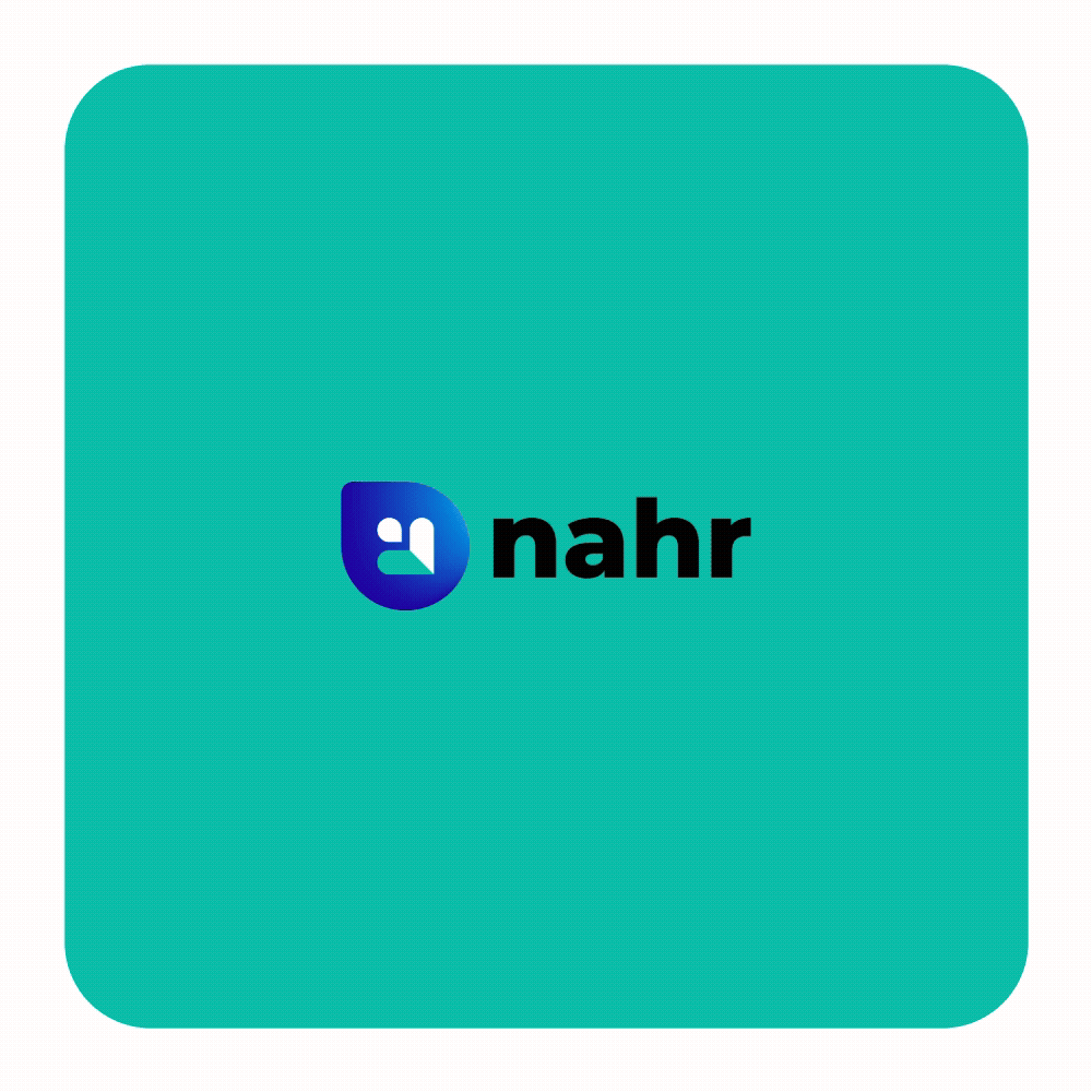
Nahr, the Arabic word for river.
It was simple, familiar, and meaningful. A river moves, gives, adapts, and makes impact without noise. That metaphor reflected the organization’s work clearly and naturally.
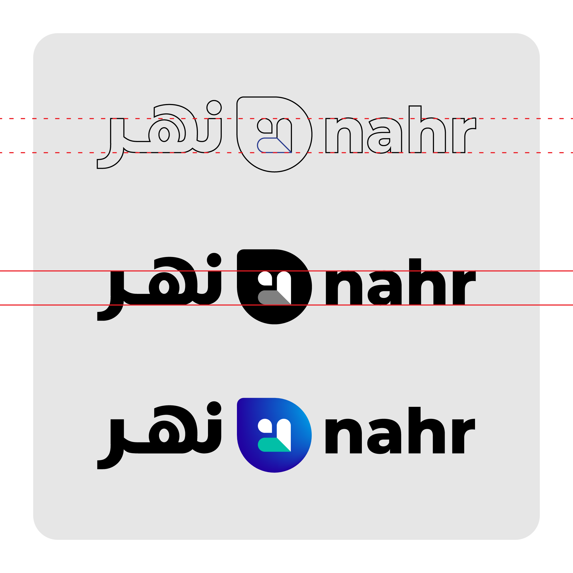
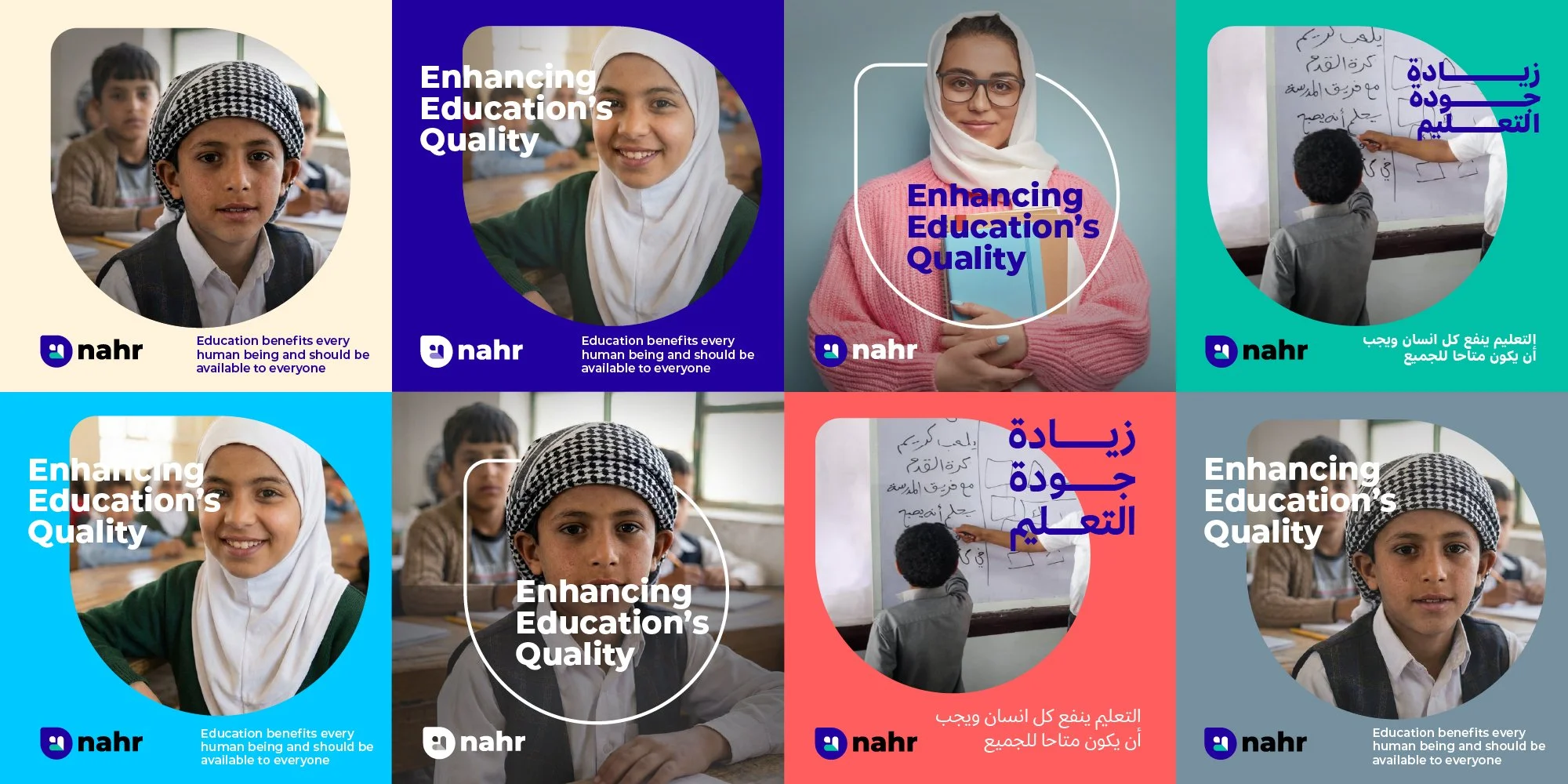
Once the name was defined, the identity followed with focus. We didn’t design from trends, but from context. The people, the environments, and the work itself. Every element had to function across Arabic and English, on paper, on screen, and in the field.
The logo was inspired by a water drop, referencing Nahr as a source of life. Inside the form, a human figure appears as an arrow, placing people at the center and symbolizing movement, direction, and progress.

This became a full branding project, built through close collaboration from start to finish. The result is an identity that goes beyond visuals. It carries meaning, respects where Nahr came from, and clearly expresses where it is going.