Tadhamon Microfinance

The branding project we designed at Snono Studio for Tadhamon Microfinance, a bank specializing in supporting small and micro enterprises, was a remarkable endeavor. Established in 2006 as part of Tadhamon Bank, which originated in Yemen in 1996, the Microfinance bank aimed to create a new visual identity that encapsulated its core values.
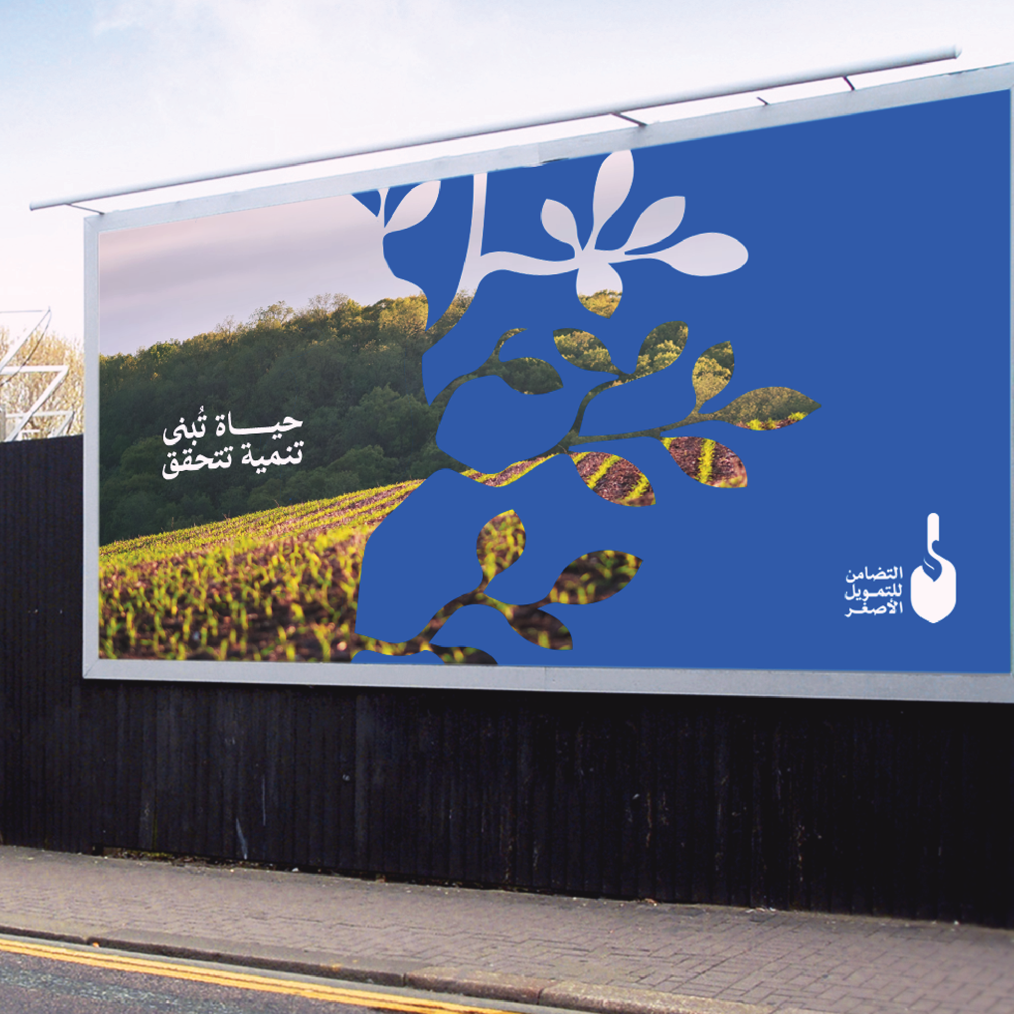
Through extensive brainstorming sessions with the client, we collectively agreed on a shovel logo with a leaf incorporated into it as the symbol for the bank's new identity. This carefully crafted logo represents growth, building, and planting, while symbolizing the patient journey towards progress. It serves as a powerful visual reminder of the bank's unwavering commitment to empowering individuals and nurturing their entrepreneurial aspirations. The Arabic typeface, designed by the renowned typographer Sultan Almaktari, complements the logo, further enhancing its visual impact.
The combination of the shovel symbol with the leaf perfectly captures the essence of Tadhamon Microfinance, effectively conveying their dedication to fostering economic growth and empowerment within the community.