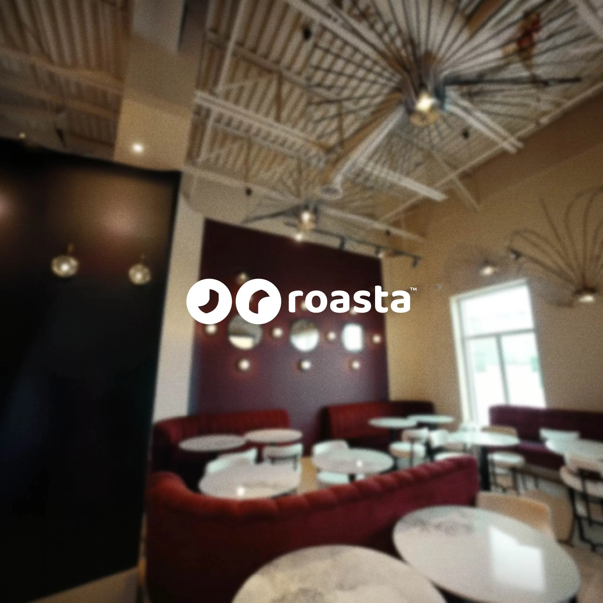
Roasta
Roasta came to us with a clear ambition: build a brand that could grow beyond Canada without losing its character. We had a rare amount of creative space to work with, from developing the name to crafting the full visual identity system.
The Challenge:
Designing for a market you haven't entered yet requires a different kind of thinking. The identity had to feel local enough to land in Canada, but carry enough openness to belong somewhere else entirely.
Our Approach:
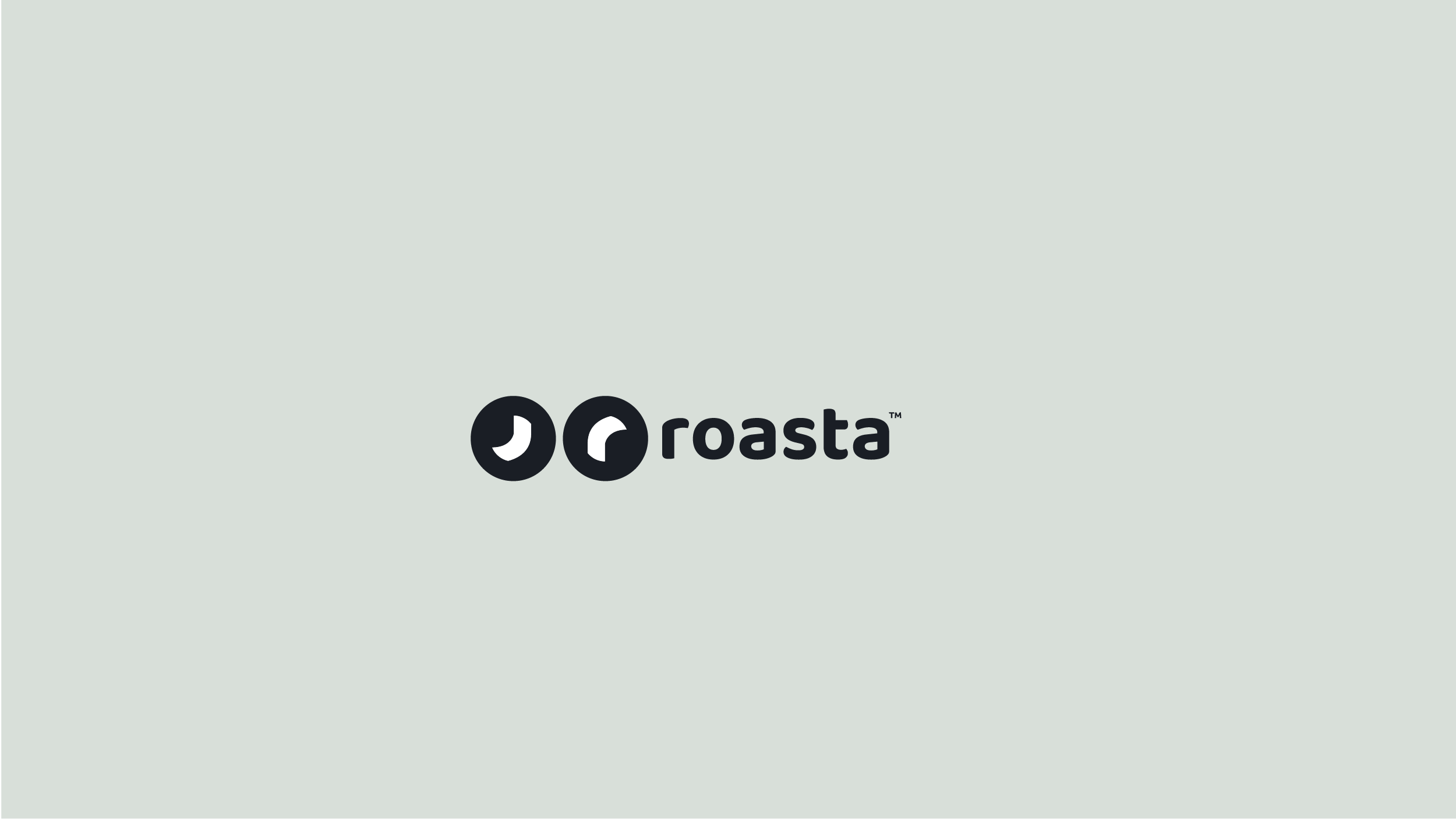
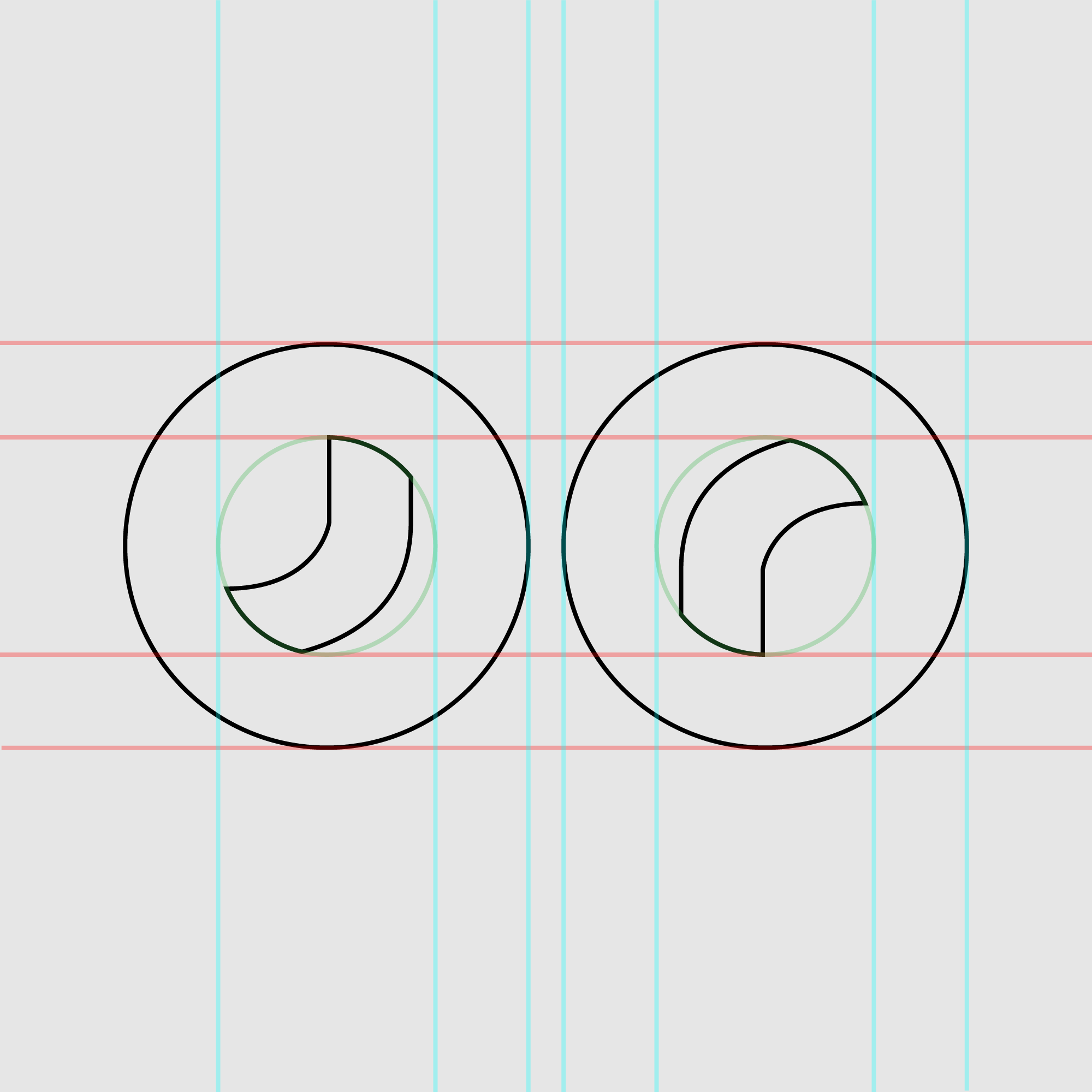
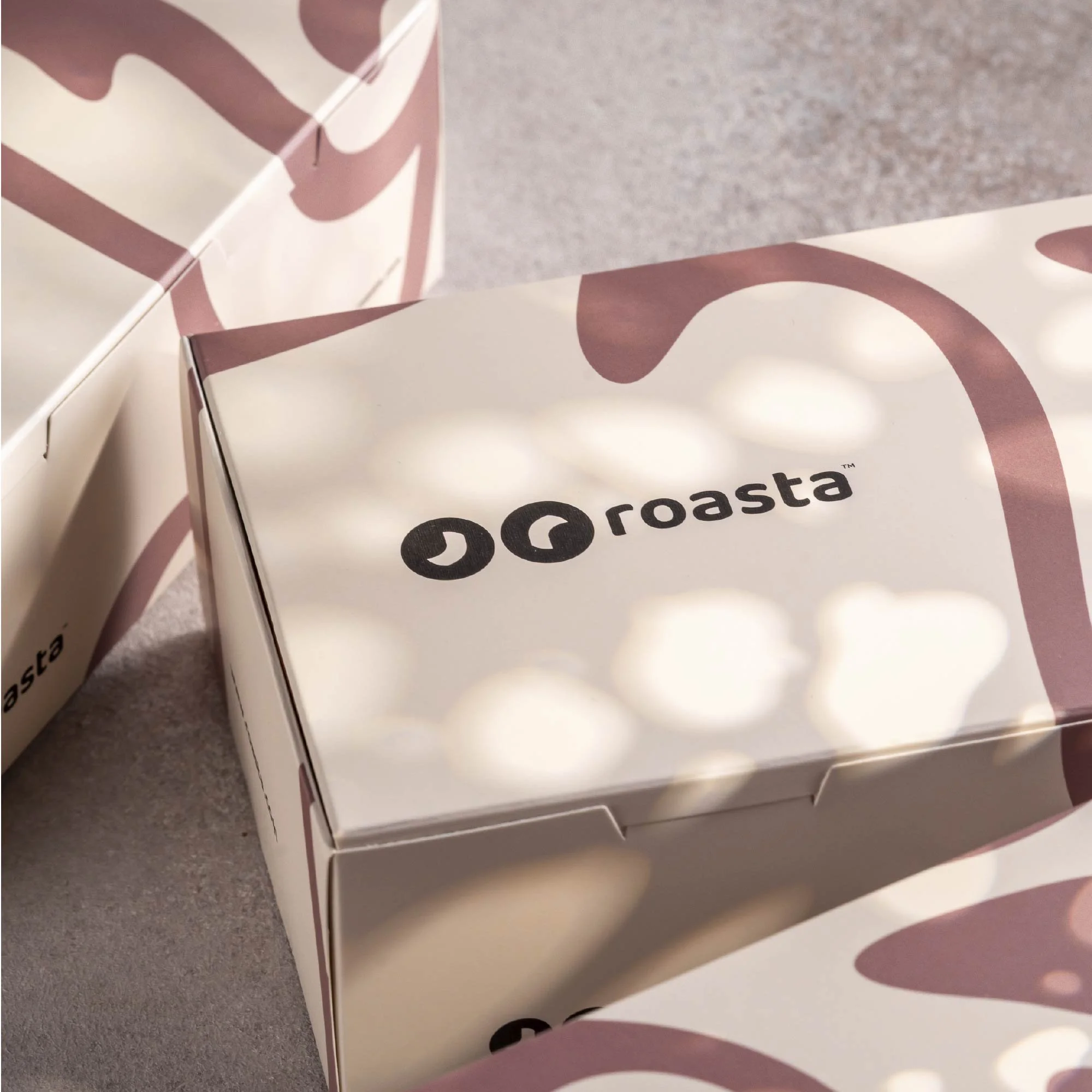
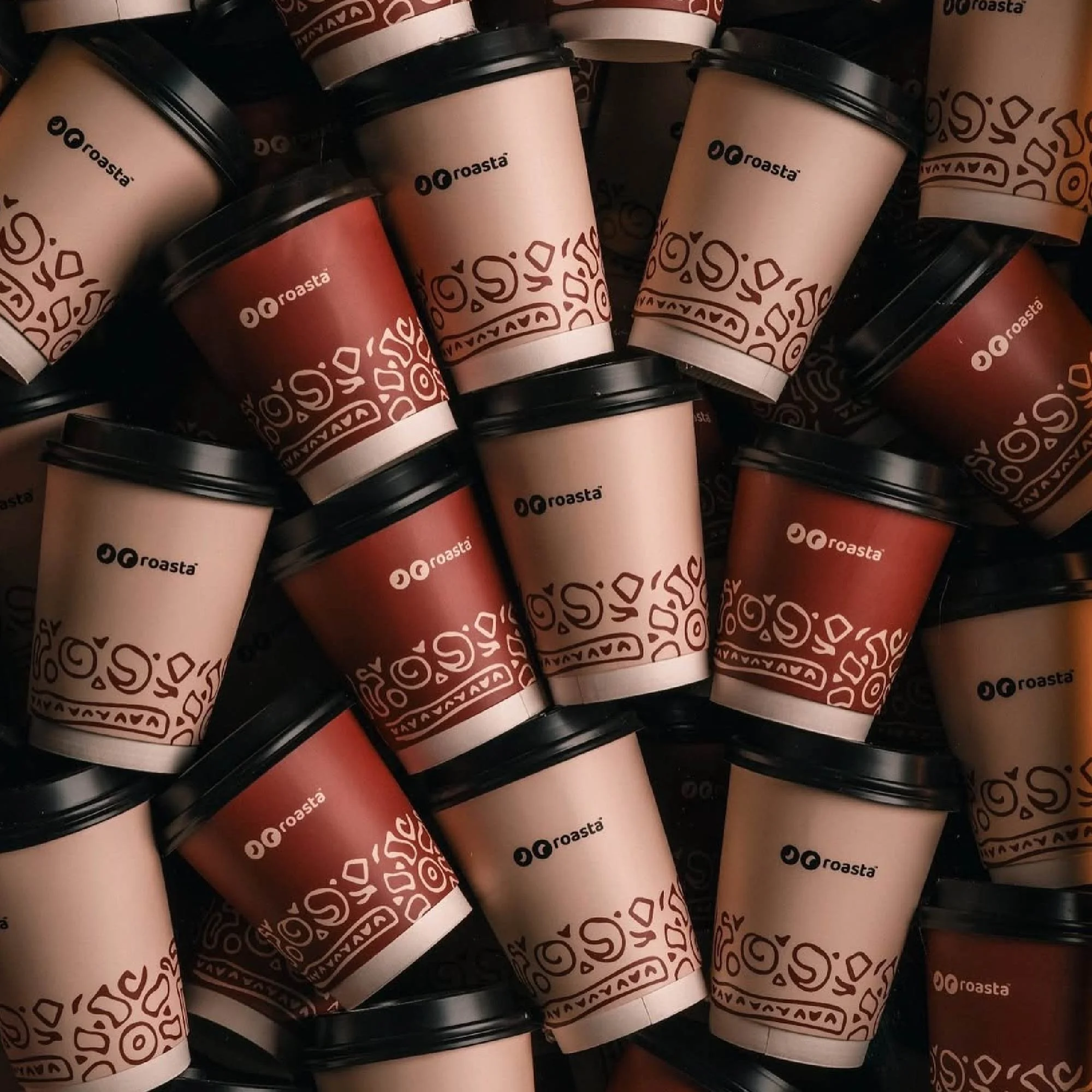
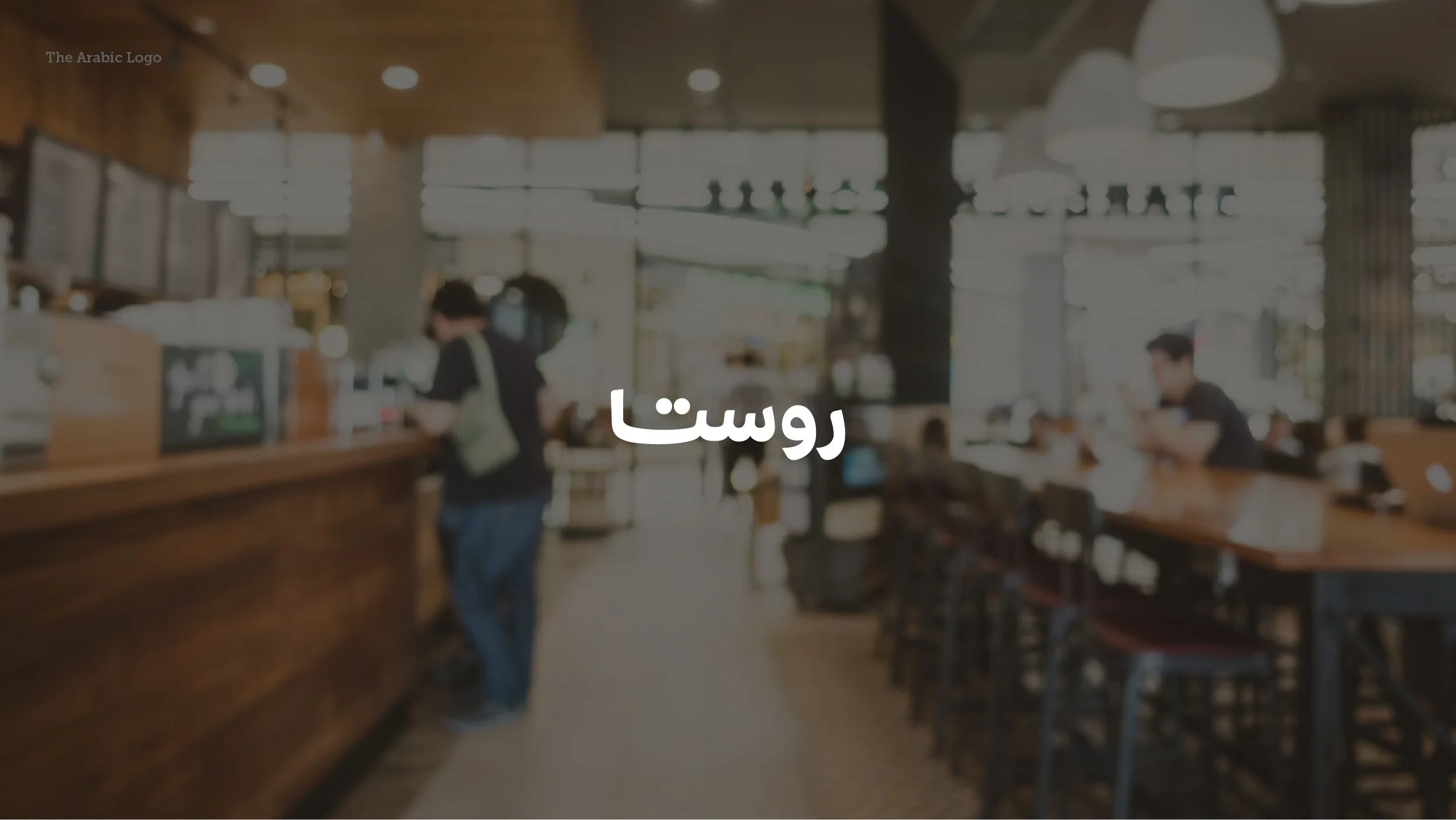
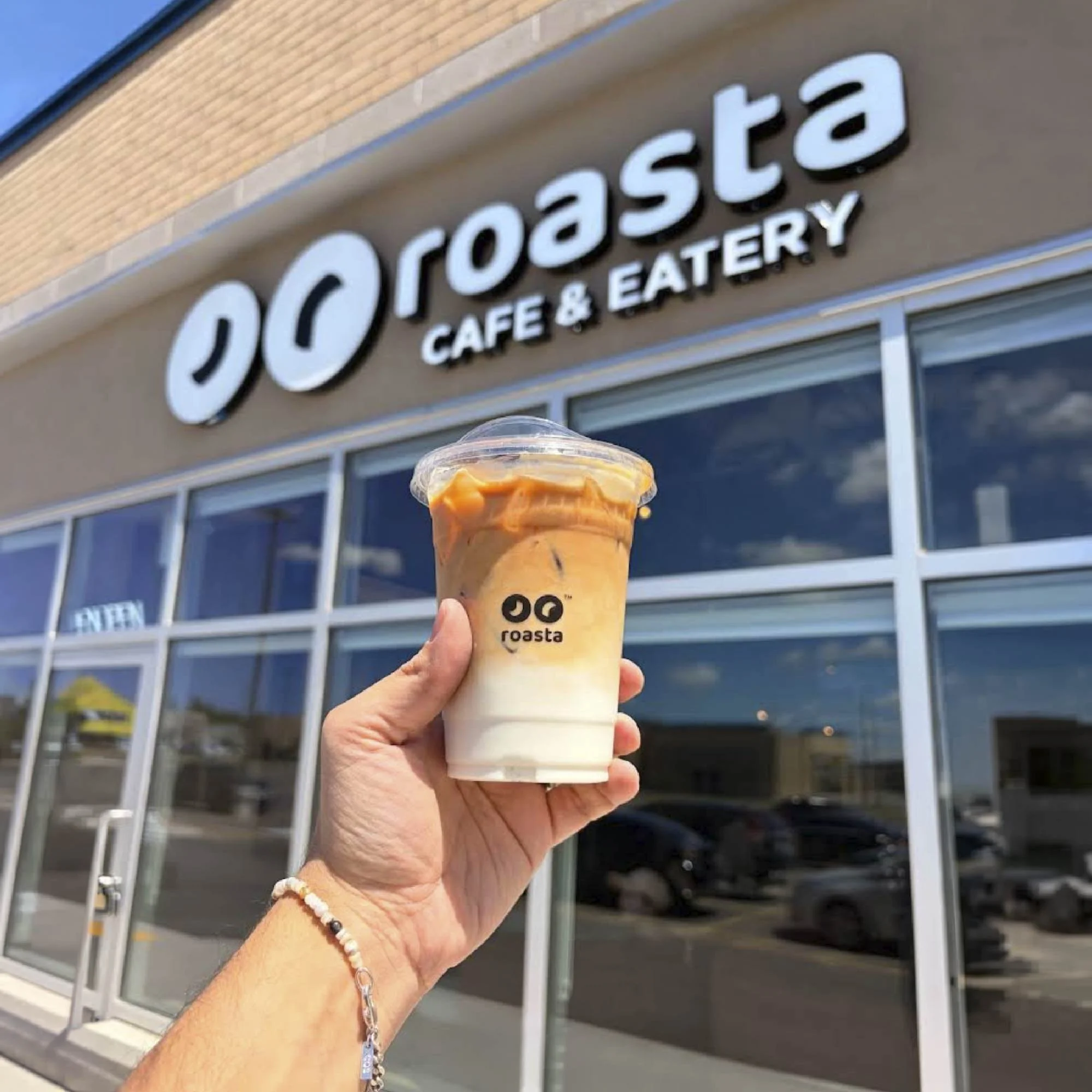
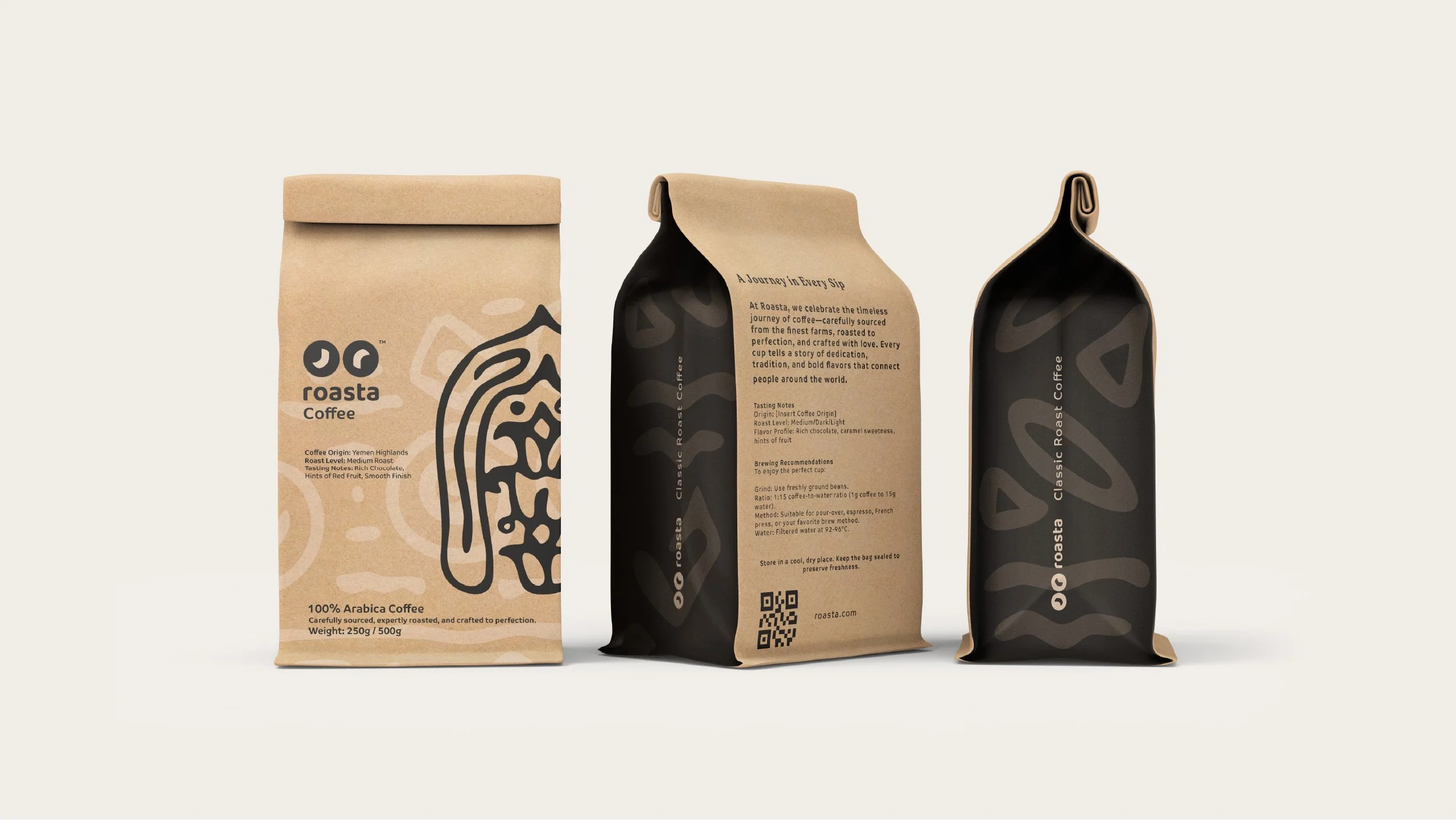
The logo is built around a combination of two letters, "ر" and "r", Arabic and Latin, placed side by side. A small detail that carries the whole brand character. It signals where the brand comes from while leaving room for where it's going.
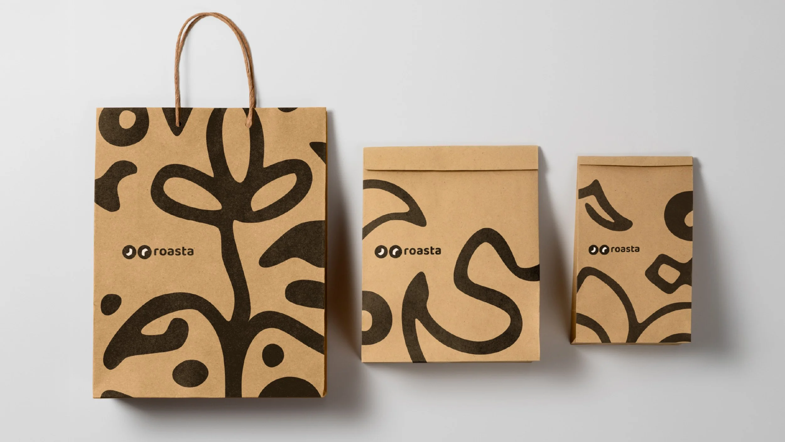
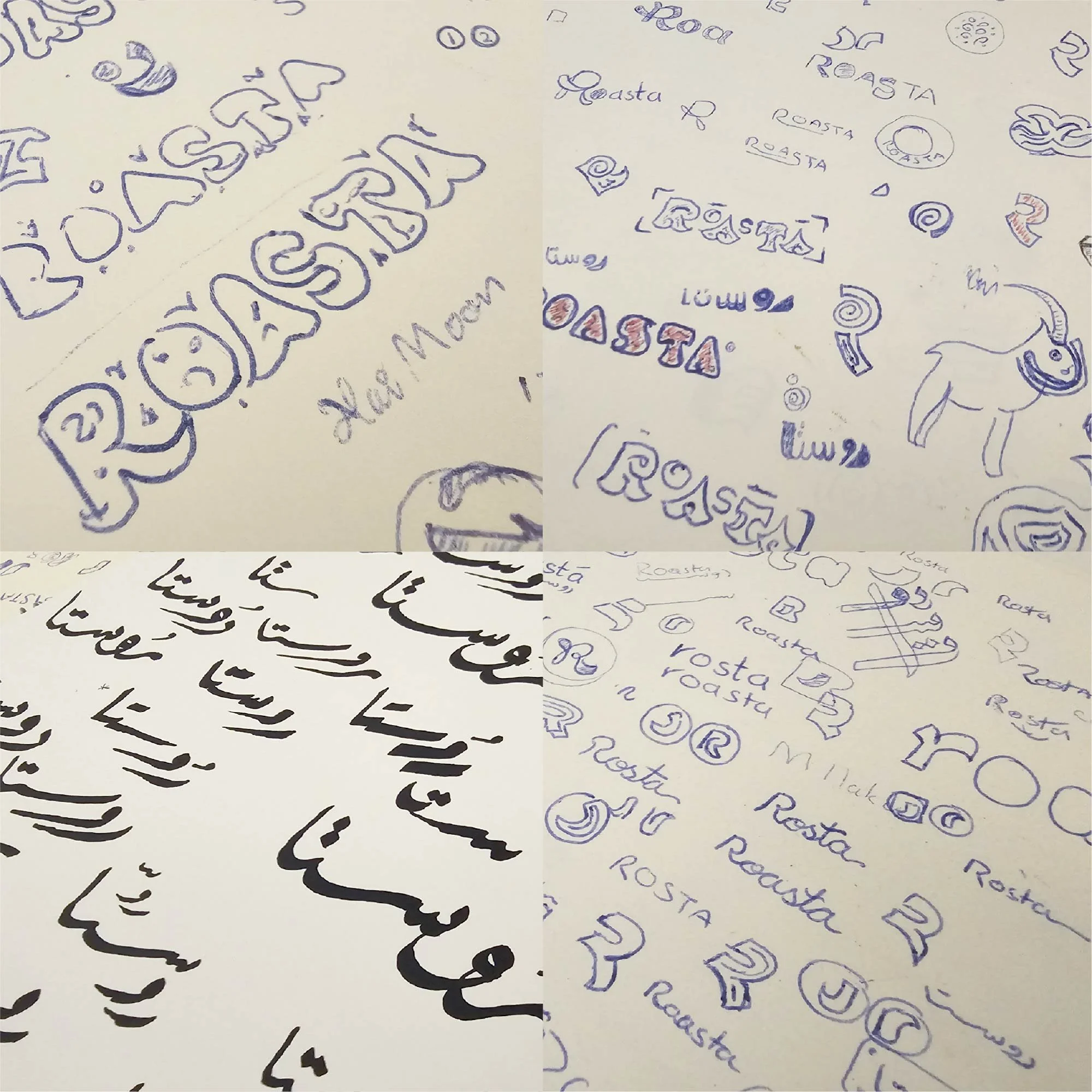
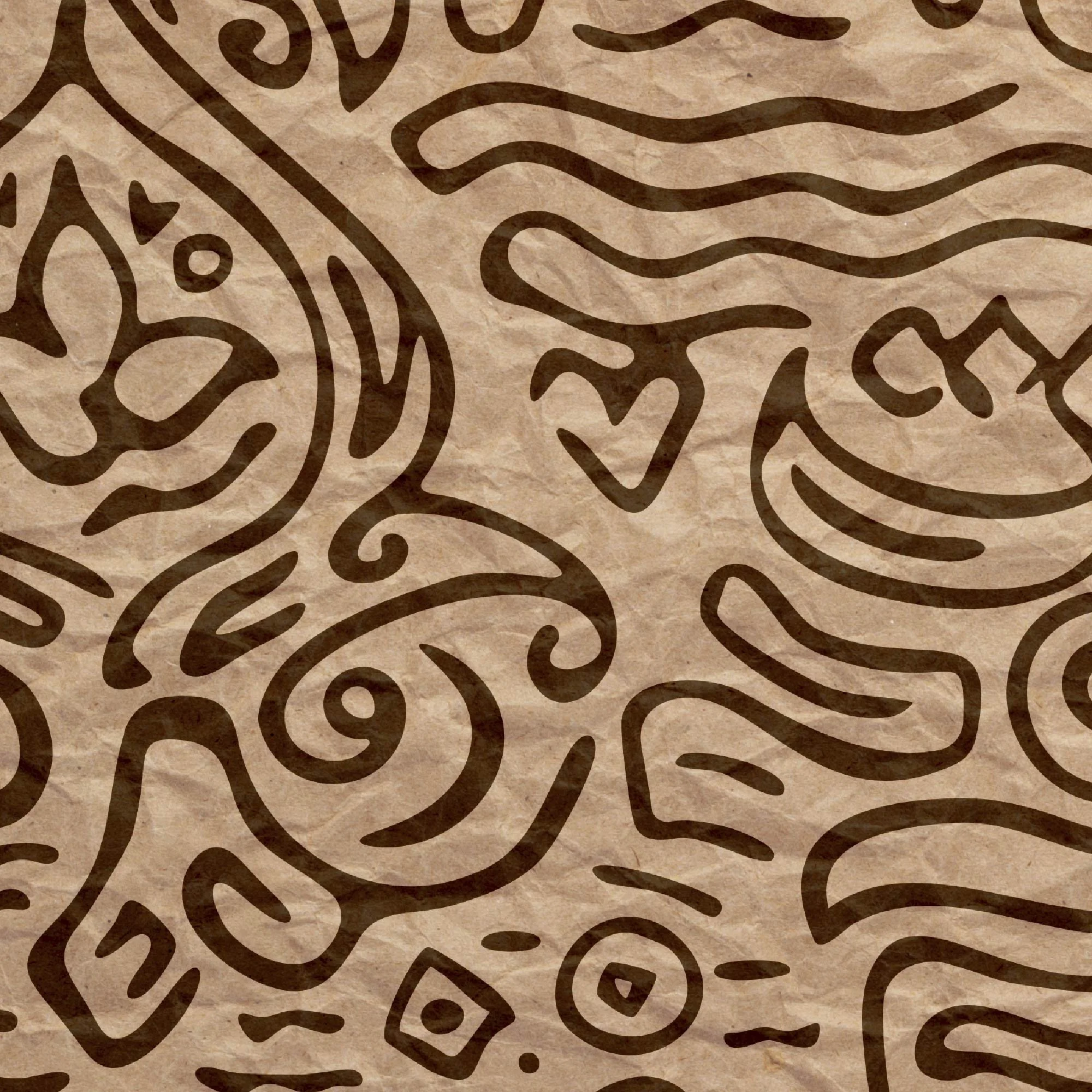
Large parts of the identity system were crafted by hand before being digitized. That process is embedded in the texture and feel of the final result.
On the Collaboration:
None of this would have come together the way it did without Roasta's team. They came in open to push, open to risk, and trusted the process even when it asked them to think bigger than the market they were starting in. To be honest, that kind of work partner is rare.