HiMoon
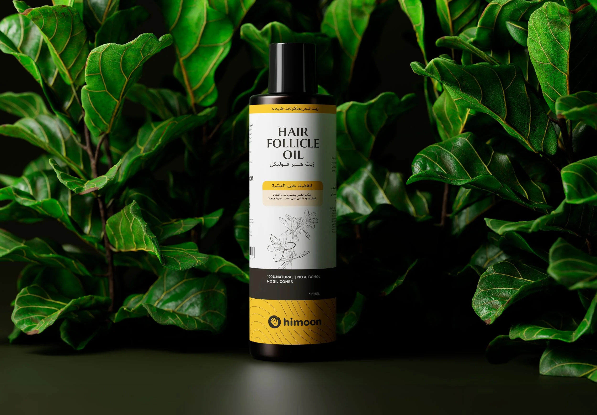
We developed the visual identity for Himoon, a Saudi brand focused on simplifying everyday care through clear, accessible products and routines with safer ingredients. The project was created by the Snono team in close collaboration with Himoon’s parent company team in Saudi Arabia.
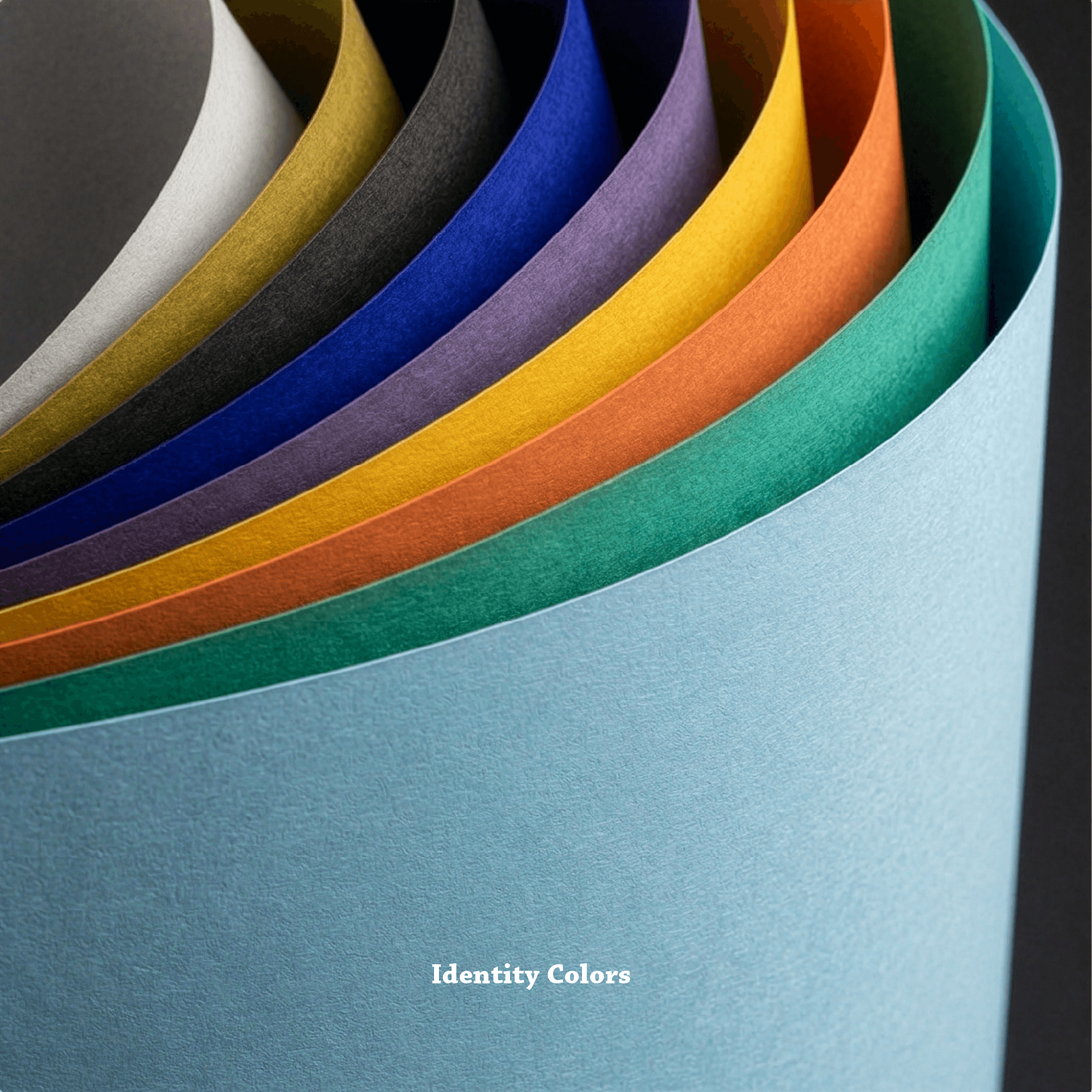
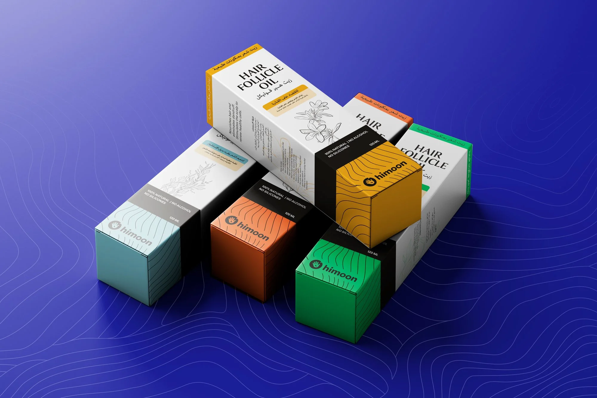
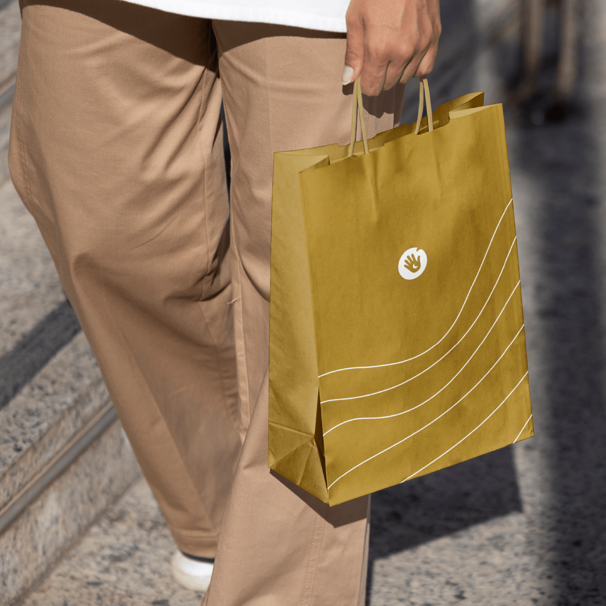
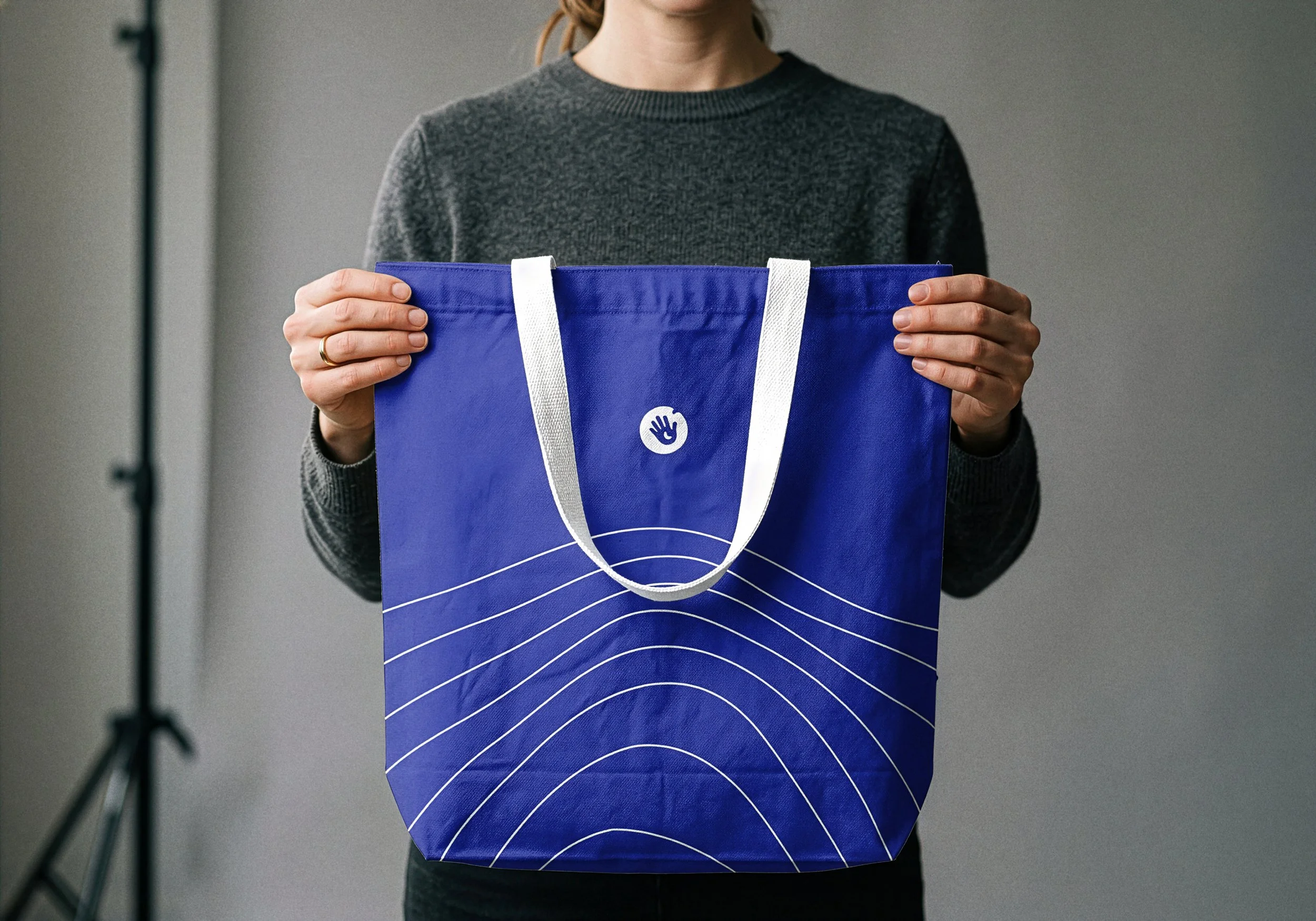
The goal was to build an identity that feels simple, approachable, and easy to recognize, while still carrying a distinct character. The result is a minimal visual language that balances clarity with a subtle sense of playfulness.
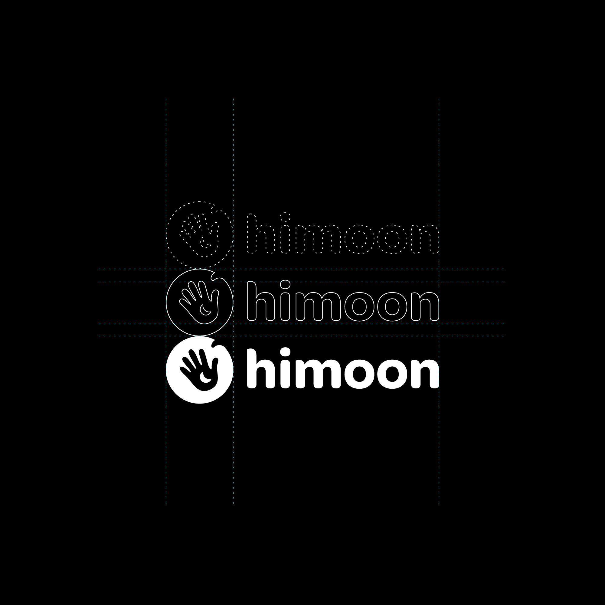
At the center of the identity is the logo, designed as a clean and memorable form. The symbol is built around a hand, representing care, connection, and approachability. At the same time, it reads as a friendly gesture, almost like saying hello.
Within the hand, a subtle moon shape appears, inspired by traditional ornamental motifs. This detail creates a quiet reference to the name “Himoon”, revealing itself gradually rather than all at once.
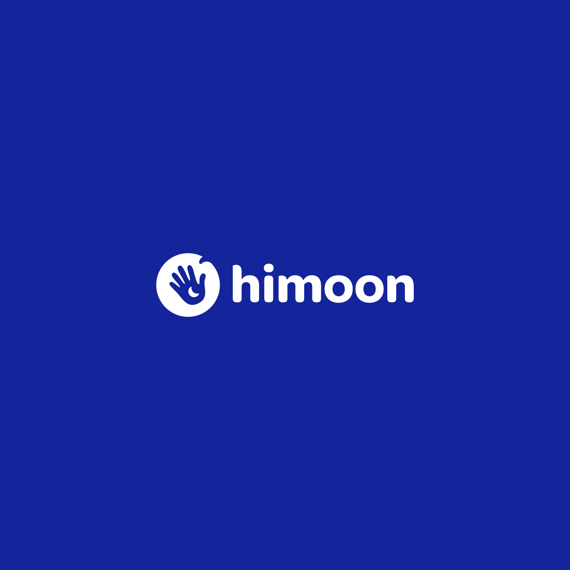
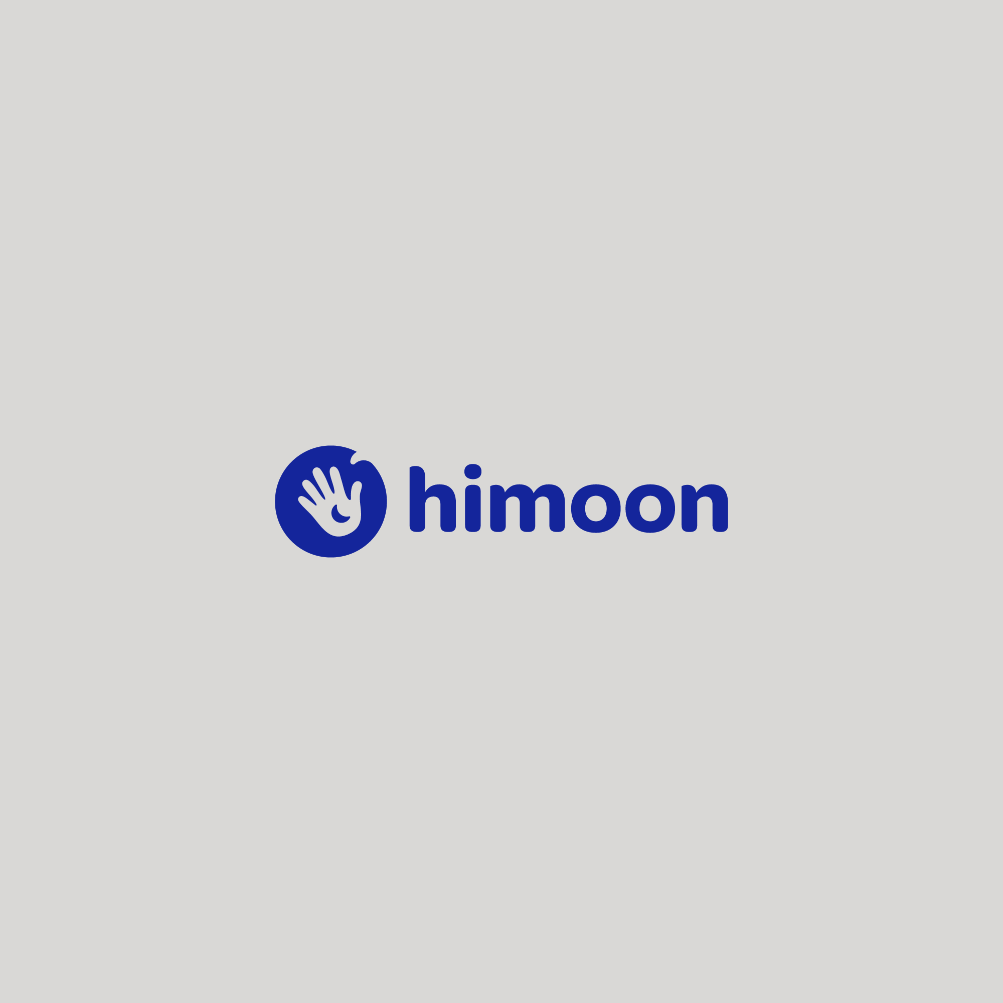
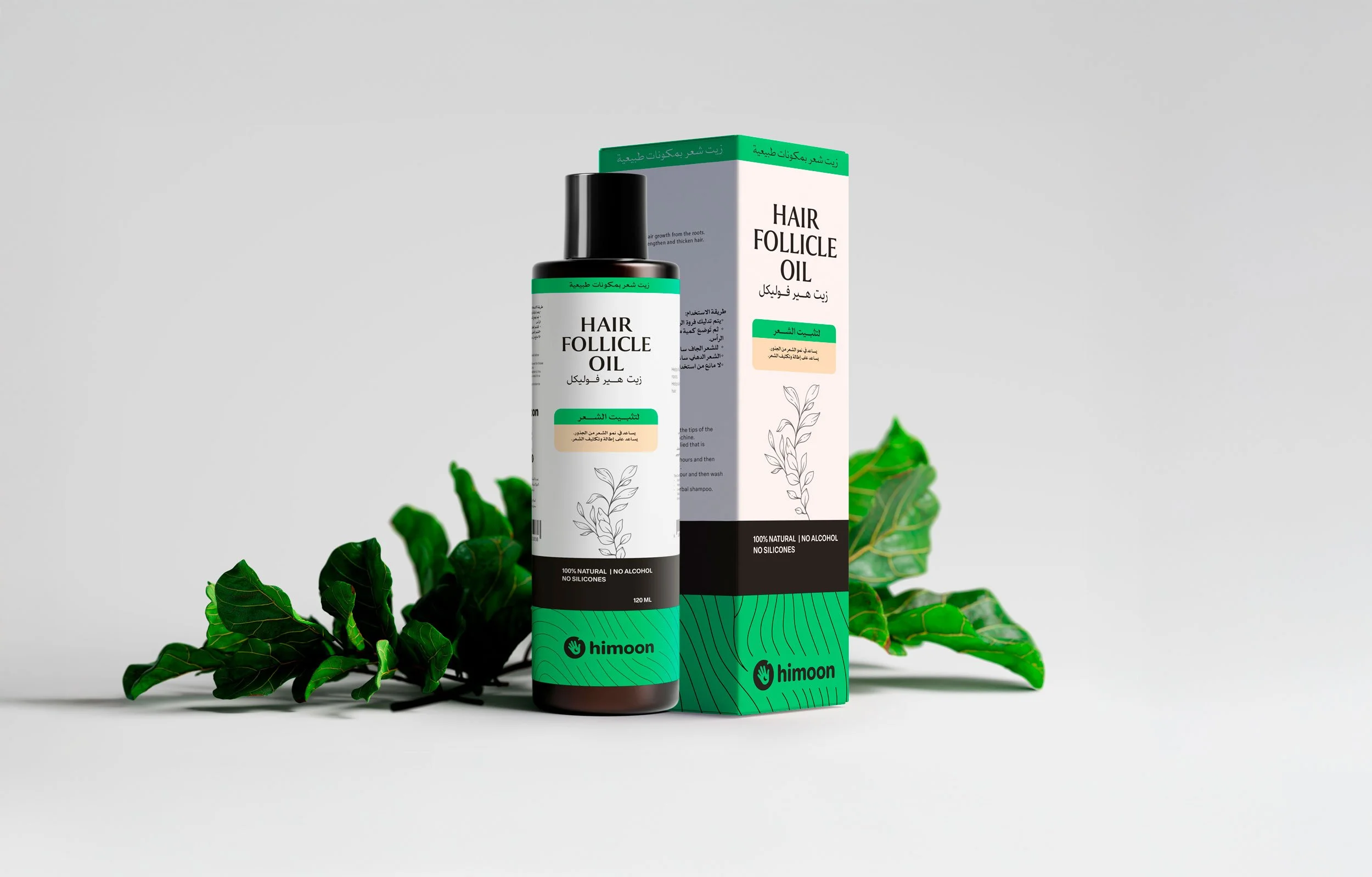
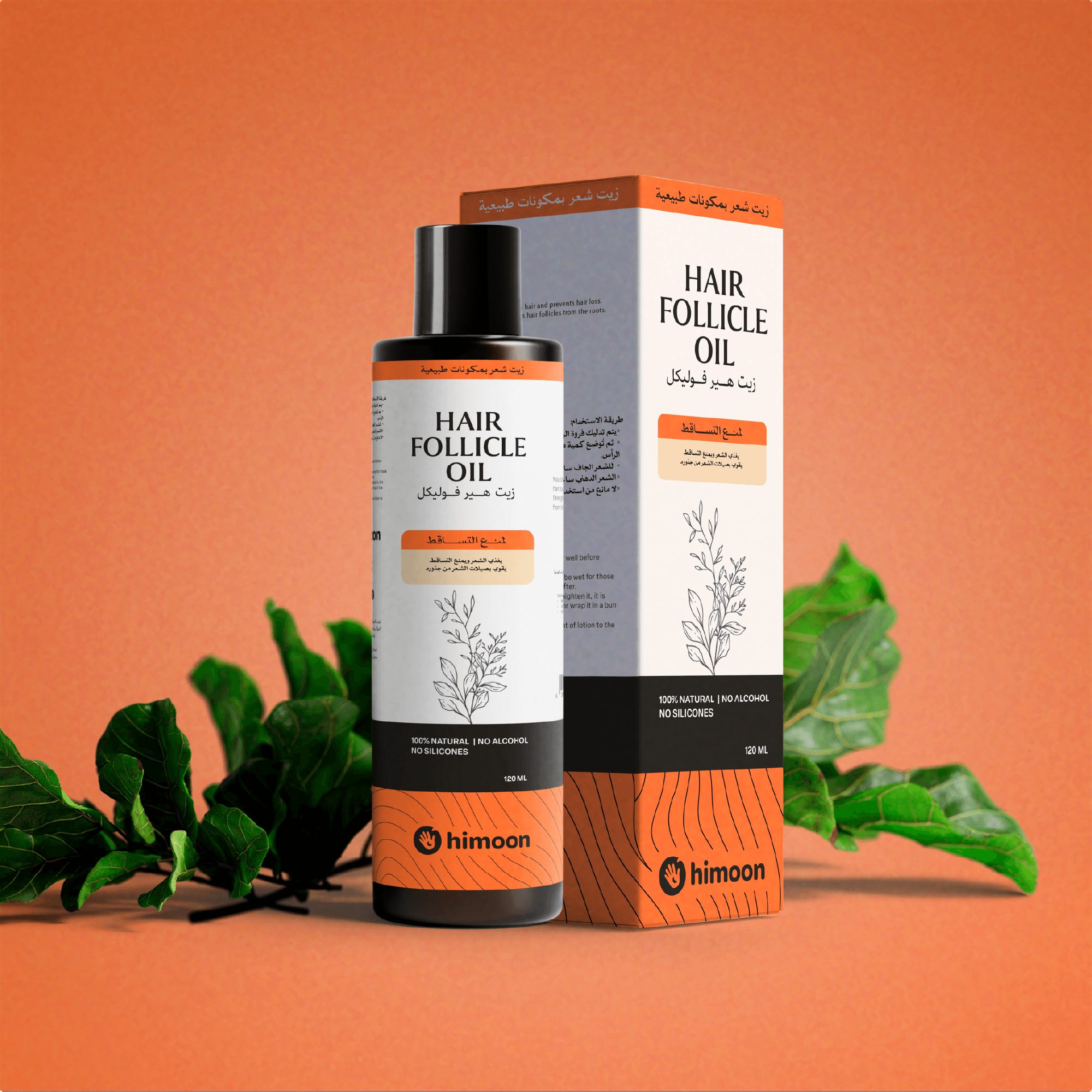
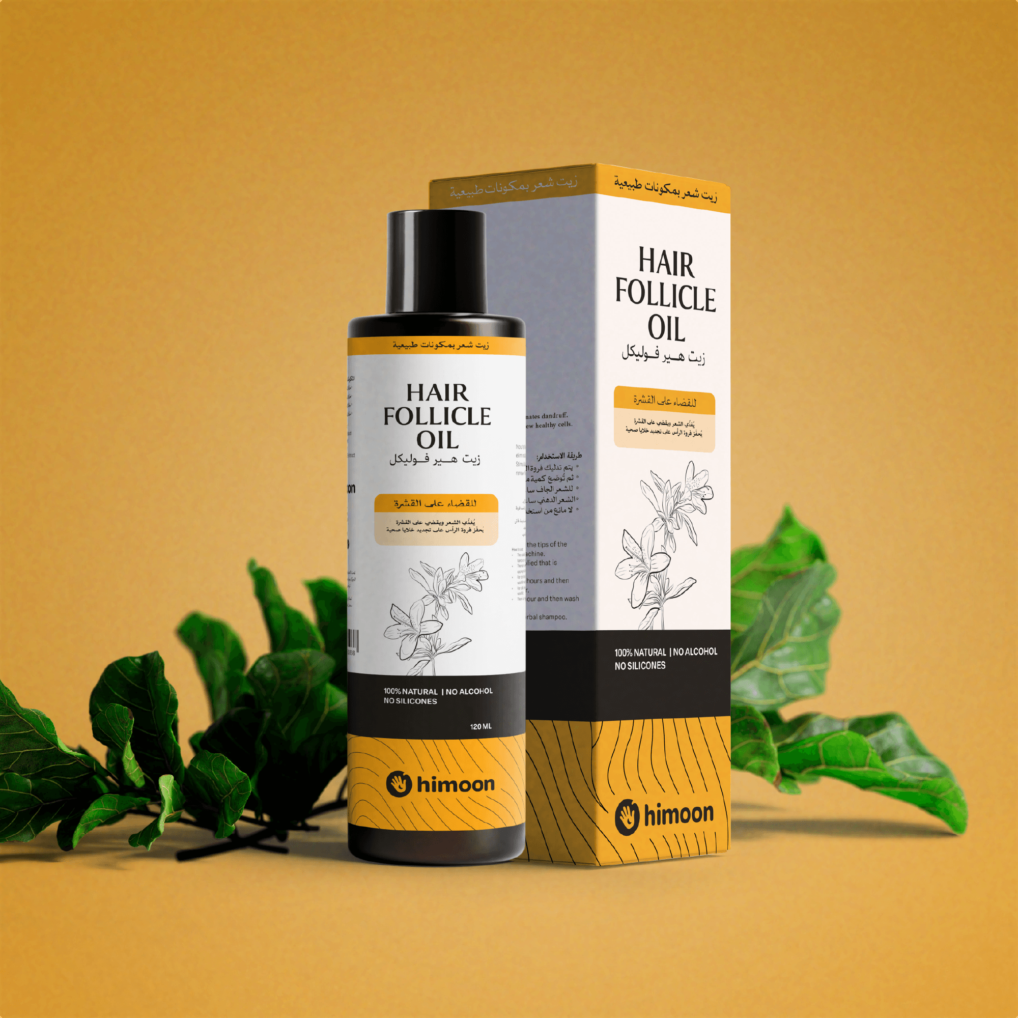
The identity was designed to be flexible and clear across different applications, supporting the brand’s intention to make everyday care feel simple, safe, and accessible.